E-Learning Trends Shaping the Future of Education
Tausif Alam
October 3, 2023
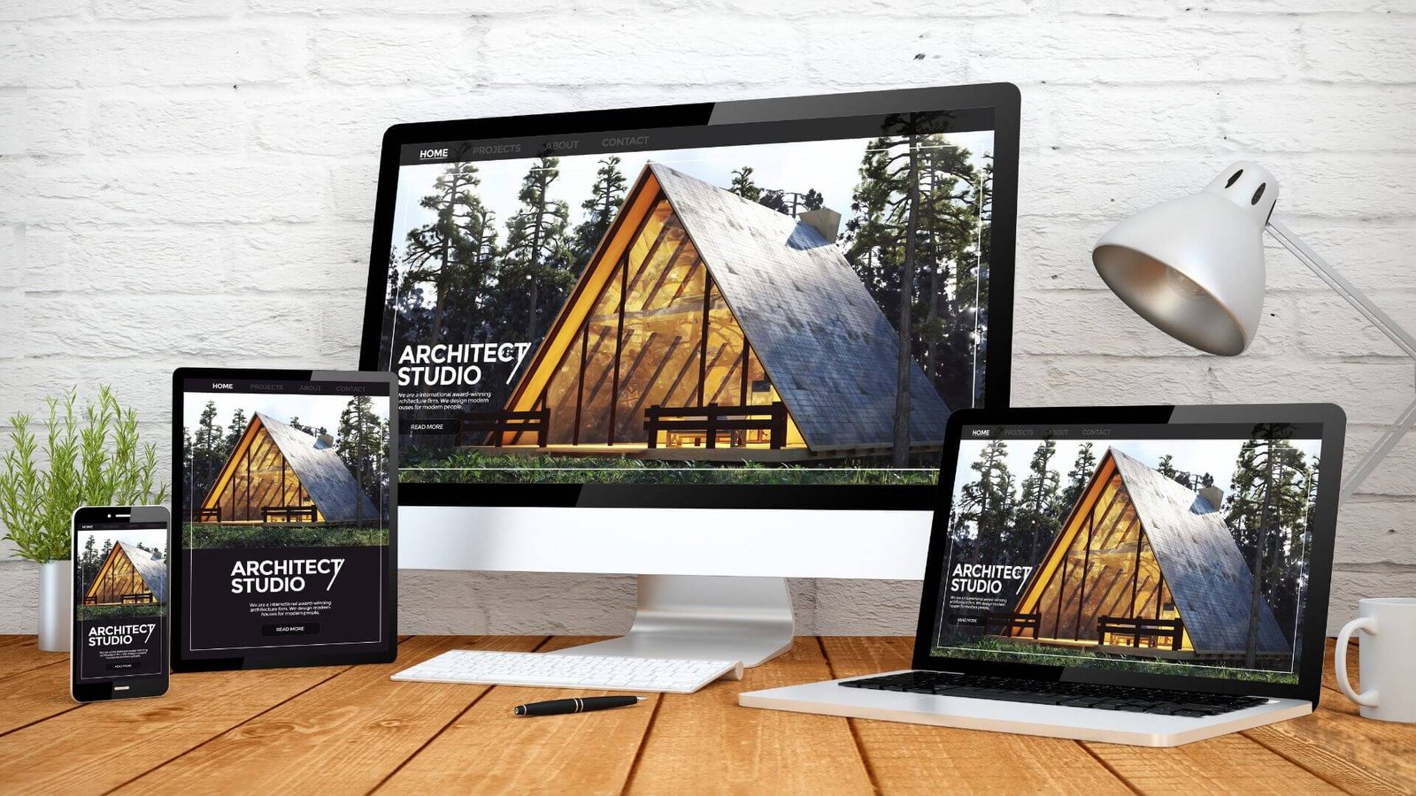
Hey, business owners! If you’re reading this blog post, you’re probably curious about something that’s incredibly important in today’s digital landscape – Responsive Web Design (RWD). No need to be intimidated; I’ve got your back! Let’s dive right in and demystify the world of RWD together.
To kick things off, let’s get on the same page. Responsive Web Design, or RWD in short, is an approach to web design and development that ensures your website looks and functions flawlessly on all kinds of devices and screen sizes. Whether your customers are visiting your website on a gigantic desktop monitor or a tiny smartphone screen, RWD ensures they have a consistent, user-friendly experience.
Now, why is RWD so crucial in the vast landscape of Design and Development? Well, let me tell you:
User Experience in Web Design: Your website’s user experience (UX) is paramount. RWD ensures that your visitors can easily navigate and interact with your site, regardless of the device they’re using.
Alright, now that we’ve established what RWD is and why it’s vital, let’s talk about why I’m here. My purpose is simple:
I want to empower you, dear business owner, with the knowledge and tools to make informed decisions about your website. We’re going to explore the core principles of RWD, the mobile-first approach, optimizing navigation, performance enhancement, testing, real-world case studies, and best practices. By the end of this article, you’ll have a solid grasp of RWD’s ins and outs.
Picture a website as a puzzle made of flexible pieces. Fluid grids are like those puzzle pieces. They use relative units, like percentages, to adapt and fit together neatly, regardless of the screen size. This flexibility is at the heart of RWD.
How they adapt to different screen sizes
Importance of resizing images
Now, let’s talk images. Resizing images is crucial because it affects your site’s load time and overall user experience. Nobody likes waiting for a website to load, right?
Techniques for making images responsive
Definition and purpose of media queries
Media queries are like the architects of your site. They help you set specific rules for how your site should look on different devices. For instance, you might want larger fonts on a big screen and smaller fonts on a smartphone.
Examples of media query syntax
					@media screen and (max-width: 600px) {
    /* Your CSS rules for screens smaller than 600px go here */
}
What are breakpoints?
Breakpoints are like decision points for your website. They’re specific screen widths where your design shifts to accommodate different devices.
How to choose appropriate breakpoints for a website
Choosing breakpoints requires thoughtful consideration. They should align with your content and design. It’s a bit like deciding where to put shelves in your store – they need to make sense of your products.
Think of the mobile-first approach as starting your website journey on a smartphone. It prioritizes simplicity, ensuring your site shines even on the smallest screens.
Better Performance: Mobile-first sites are often faster because they focus on essentials.
Simplify Navigation: Keep menus and buttons simple and easy to tap.
User Experience in web design is all about ease of use. Intuitive navigation is like having clear signs in a store – it guides visitors smoothly.
Off-Canvas Menus: Consider hidden menus that appear when needed.
Touch-Friendly Elements: Ensure buttons and links are easy to tap.
Performance is crucial because slow websites drive visitors away. Nobody has time for that!
Lazy Loading: Load images as users scroll, reducing initial load time.
Google Page Speed Insights: A handy tool to analyze your site’s performance.
Testing is like quality control for your website. It ensures everything works as expected, no matter the device.
Browser Developer Tools: Use these tools to simulate different devices.
Layout Distortions: Use CSS fixes like overflow: hidden to prevent layout issues.
Let’s dive into some real examples of how RWD can work wonders:
Airbnb: Their mobile-first approach ensures a seamless booking experience on all devices.
These sites excel in providing an excellent User Experience in web design. They prioritize content, maintain consistent branding, and adapt beautifully to various devices.
Take inspiration from these examples. Prioritize content, embrace simplicity, and test your site extensively.
Key takeaways and actionable tips
We’ve covered a lot, haven’t we? Remember, it all comes down to fluid grids, flexible images, media queries, and breakpoints.
Responsive Web Design is a dynamic field. Stay curious, keep learning, and adapt to new design and development trends.
Responsive Web Design isn’t just a trend; it’s a necessity in today’s digital world. Prioritizing RWD means prioritizing your audience’s experience.
In Design and Development, RWD is the bedrock of creating websites that truly connect with users. It’s not just about being mobile-friendly; it’s about being user-friendly across the board.
Take what you’ve learned here and put it into action. Your website’s responsiveness will set you apart in a crowded digital landscape. Make RWD your secret weapon in web design and development.
That’s a wrap! Thanks for joining me on this journey through the fundamentals of Responsive Web Design. Now, go forth and create web experiences that truly wow your audience!
we are available 24/7 to answer any questions or concerns you may have about our services or your business growth.
Sign up for our newsletter to get updated information, news, and free insight.
We specialize in providing the best solutions to help your business thrive and achieve new levels of success.
we are available 24/7 to answer any questions or concerns you may have about our services or your business growth.
Web Development & Digital Marketing Agency
Copyright © 2024. All rights reserved.